InfiNitY-™ Posted June 5, 2020 Posted June 5, 2020 > Opponent's nickname: @-Sn!PeR- > Theme (must be an image):https://imgur.com/a/uEn1PnL > Work Type:avatar > Size & Texts: 150x250 / Freedom > How many votes?: 10 > Work time: 6 hours 1
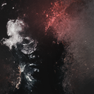
champagnepapi Posted June 5, 2020 Posted June 5, 2020 v1- I like some effects that u have set on the image, but i dont like the darkened view of the picture becuase its a sea view, and the beautiful thing of that view is the BLUE color, drop shadow on text its bad v2- The image view it better, but the text its really bad I vote V1 becuase its some more complicated work and got more commitment from the designer 2
Lock流 Posted June 5, 2020 Posted June 5, 2020 v1 , text look's fantastic but it had too much darker gradient i believe that it will be better if u set it between 40% & 60% v2 ,have a nice blur but the gif it's not enough to make the avatar looks good cuz it is the only effect i see on the avatar and the text doesn't match the picture as well so i vote v1 for the nice text 1 2
-Sn!PeR- Posted June 6, 2020 Posted June 6, 2020 (edited) Enough votes V1 won (Infinity) with 8 votes. V2 lose (me) with 1 vote. Edited June 6, 2020 by Meh Rez vM ! ♫ Topic Closed 1

 Premium
Recommended Posts