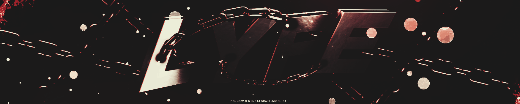
lyfe
1513584964_FrankSinatra-L.O.V.E.(lyrics).mp3
00:00/00:00
- 1513584964_FrankSinatra-L.O.V.E.(lyrics).mp3
2 Followers

Recent Profile Visitors
972 profile views


lyfe's Achievements
")


-
 lyfe changed their profile photo
 -
I guess i ll vote for V1 for keeping the color on work + text. B&W isn t a good choice for battles 🙂. v2 if you put the main text Sword you should paste the effects arround the sword on stock(not a border), Btw on the original sized stock there is a bit of warm color so you could play with the brushes RED on left and BLUE on right for an contrasting tone. Something like that: Anyway good job!
-
V1- simple text but also awesome, clear text. That brush could be a little less visible.
-
V2-text,blur,border,resize.
-
V3- clean effects, nice text.
-
Accept
-
I want primary font please. ❤️ @Y A S H™ Thank you!
-
V3- text, effects, resize.
-
V2: blur, clear (b&c effect), good text and nice border.